VinylCircle
UIUX Design
Overview
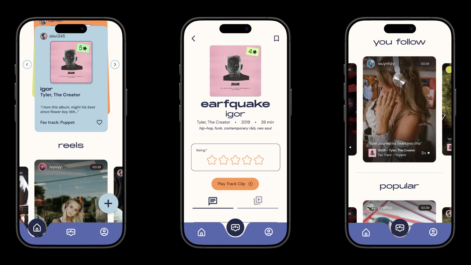
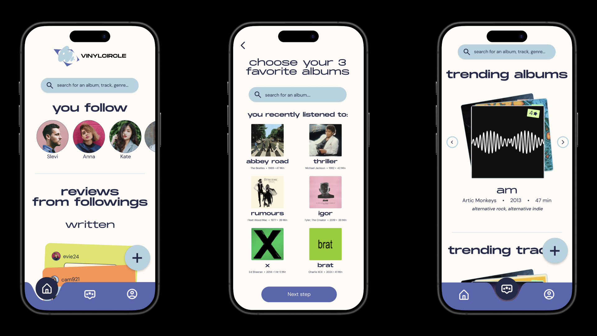
VinylCircle is a social music discovery platform built for people who believe music is better when it is shared. While discovery apps help users find new songs and rating platforms let them review albums, few bring these experiences together in a meaningful way. VinylCircle combines album discovery, personal ratings, reviews, and social interaction into one community-driven experience, making it easier to discover new music, exchange opinions, and connect with others through shared listening tastes.
- Timeline
- 6 months
- Team
- Chem, Ella, Brianna, Rosie, Sue
- Status
- Complete
Music platforms are fast, but collecting records is tactile, social, and full of memory.
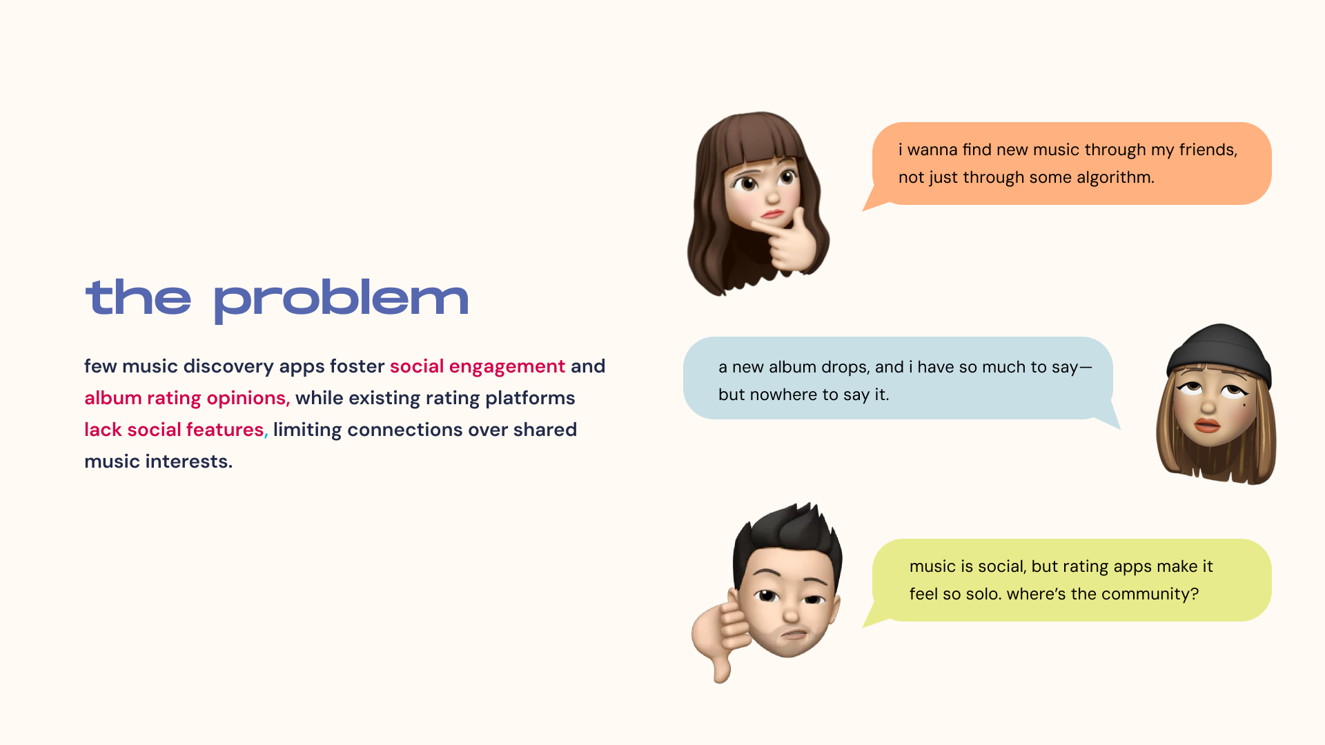
Few music discovery apps foster social engagement around album ratings and opinions, while existing rating platforms lack social features altogether — limiting the connections people could be making over shared music taste.
Competitive Analysis
Rate Your Music, Musotic, and Musicboard offer music reviews with different focuses, but each falls short on social features or depth; Letterboxd and Goodreads build strong communities for movies and books, and last.fm tracks listening habits but lacks meaningful discussion. VinylCircle merges a Spotify-powered listening experience with community features, detailed album reviews, personalized profiles, and real-time activity with friends — a combination none of its competitors offer in one app.
Affinity Mapping
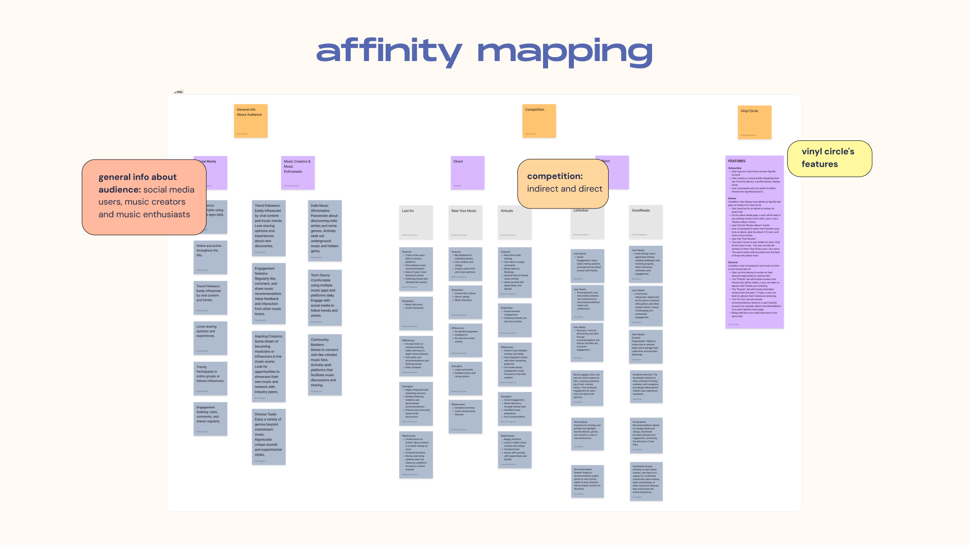
We ran an affinity mapping exercise to sort general audience info, competitor patterns, and VinylCircle's own feature ideas into clear groups — surfacing three core audience types and clarifying which features would set VinylCircle apart from indirect and direct competitors alike.
Persona
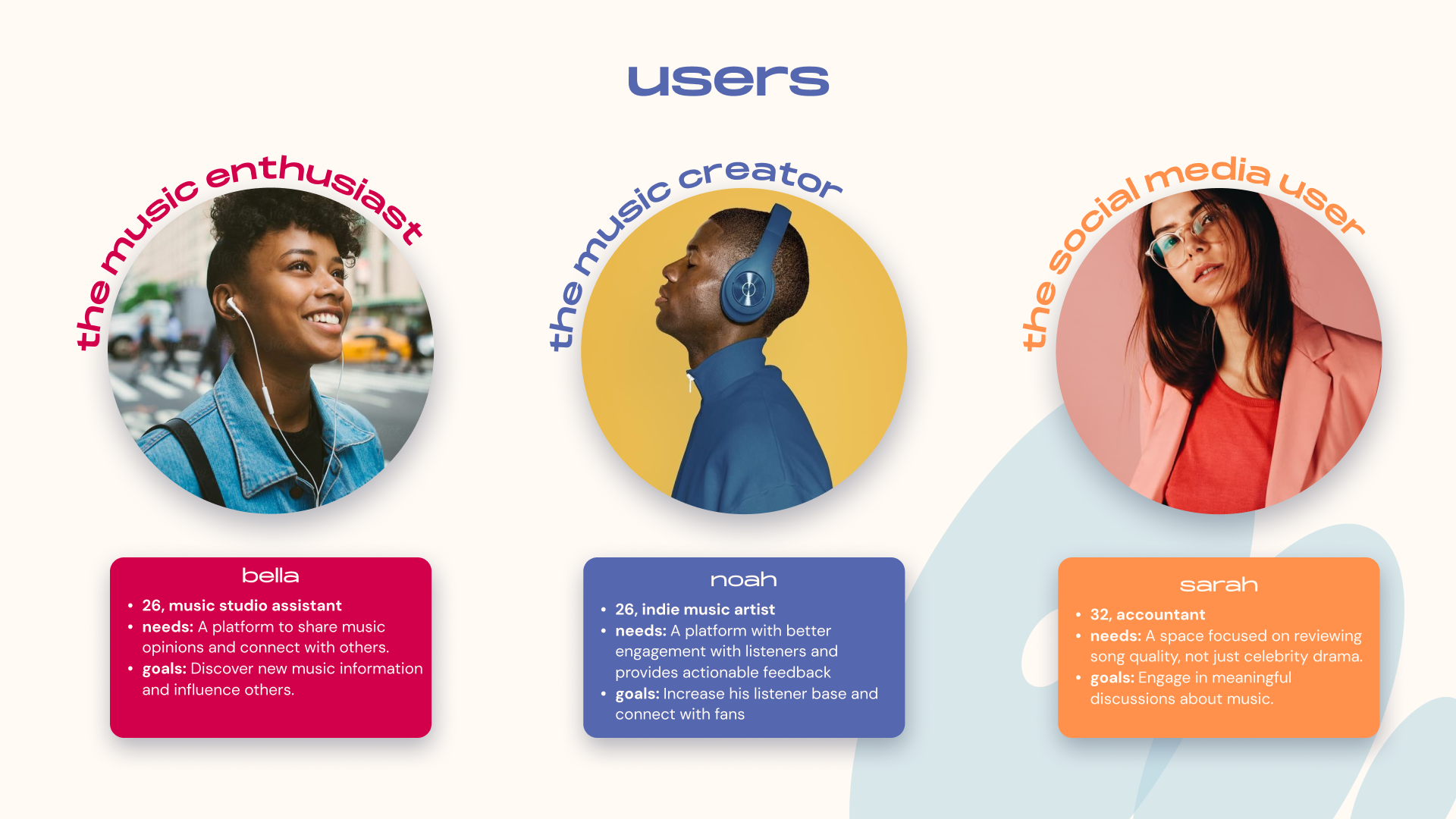
Bella, our music enthusiast, wants a platform to share opinions and connect with others but struggles to find community around niche genres. Noah, our musician, needs better engagement and actionable feedback from listeners than Spotify offers. Sarah, our social media user, wants a space focused on song quality — not celebrity drama.
Card Sort
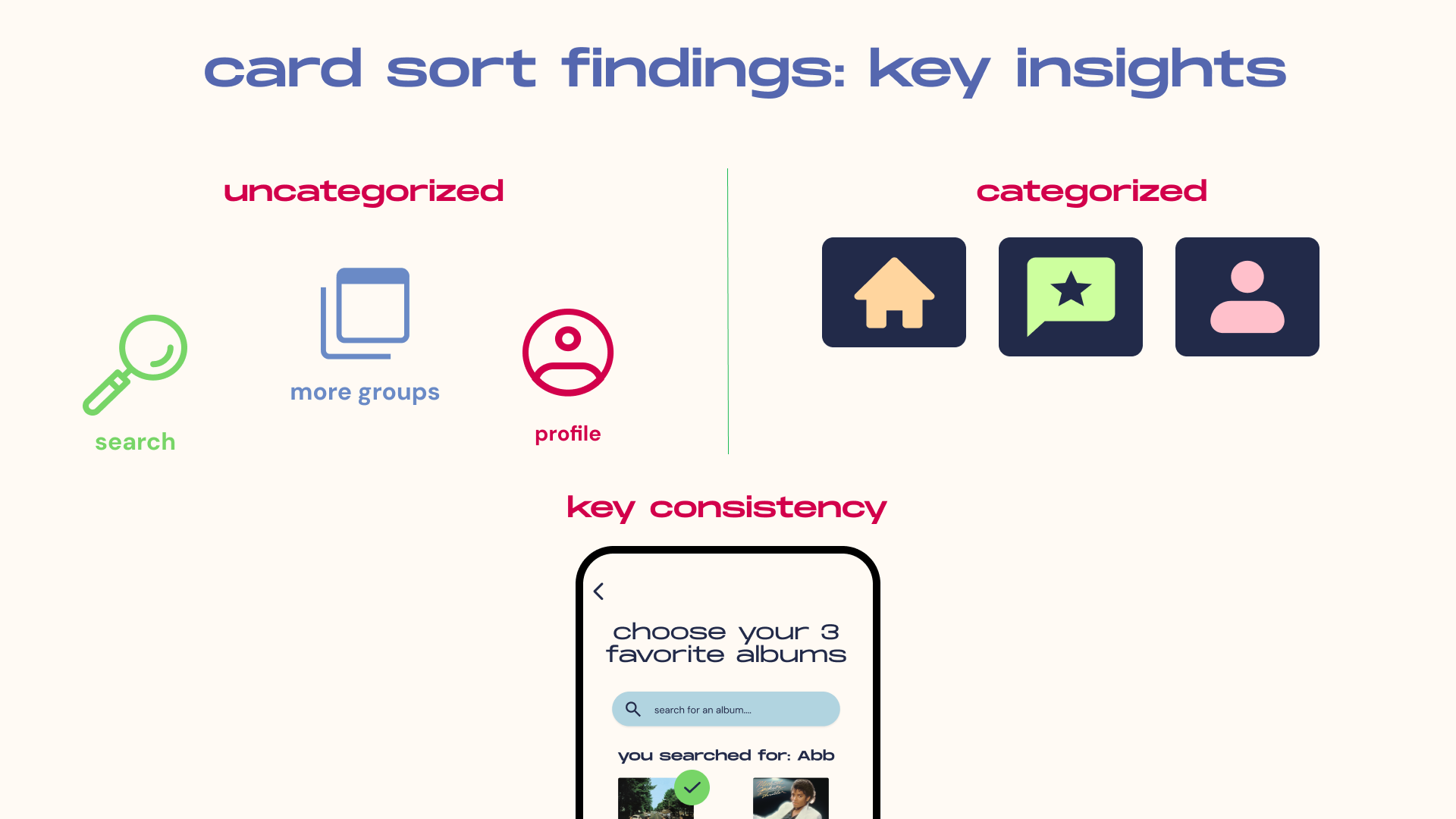
Card sorting confirmed the app's core structure: participants consistently grouped "showcase your 3 favorite albums" under Profile, and paired actions like rating an album and writing a review into their own Reviews category. Building the sitemap directly from these groupings meant the final navigation matches how people already think about their music library.
Journey Mapping
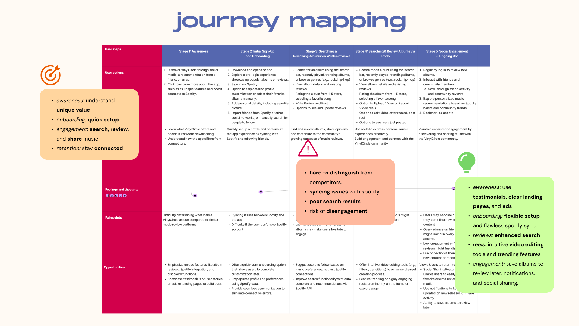
Across the awareness, onboarding, engagement, and retention stages, we mapped where users would drop off — syncing issues with Spotify, poor search results for niche albums, and the risk of disengagement without fresh content — and turned each into a concrete opportunity, from flexible onboarding to smarter search and social sharing.
Logo
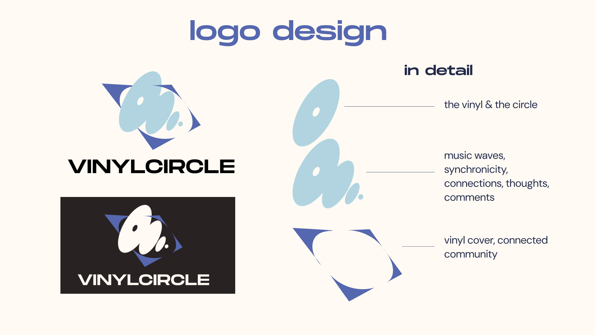
The logo pairs a wordmark and logomark shown on light and dark backgrounds. The top ellipse represents a vinyl record, the duplicated shape suggests music waves and connection, and the hollow square nods to a vinyl cover — together reflecting the connected community VinylCircle is built around.
Color Palette
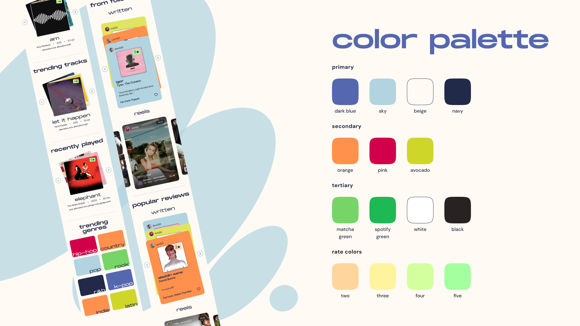
Primary, secondary, tertiary, and rate colors (used for album rating stickers) draw inspiration from the vibrant tones of Spotify Wrapped, chosen to feel joyful and bright. Every background-foreground pairing was checked against a color contrast checker to keep the palette accessible.
Design System
Explore the full design system below.
Sitemap
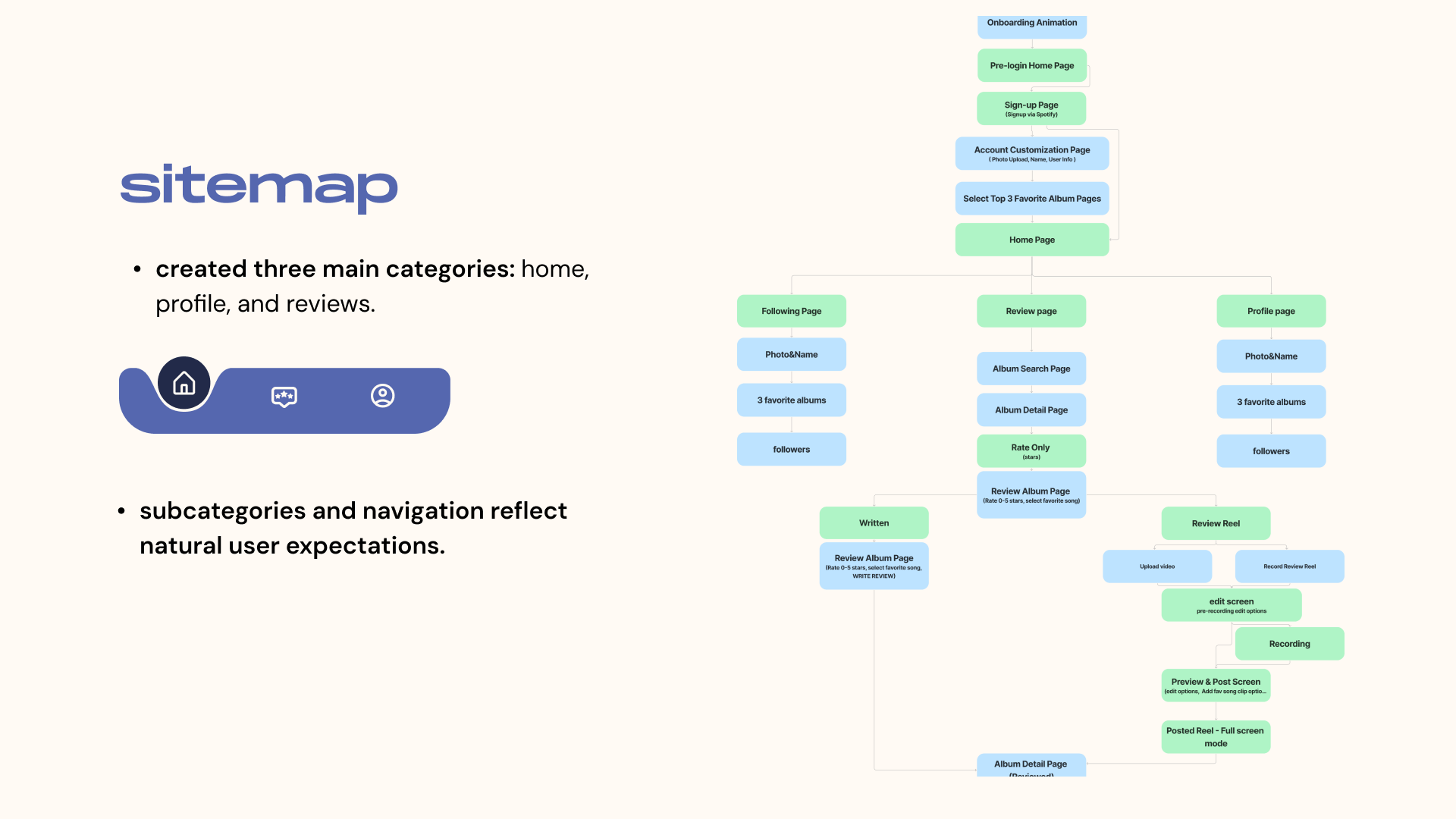
The sitemap organizes the app into three main categories — home, profile, and reviews — with subcategories and navigation designed to reflect natural user expectations.
Sketches & Wireframes
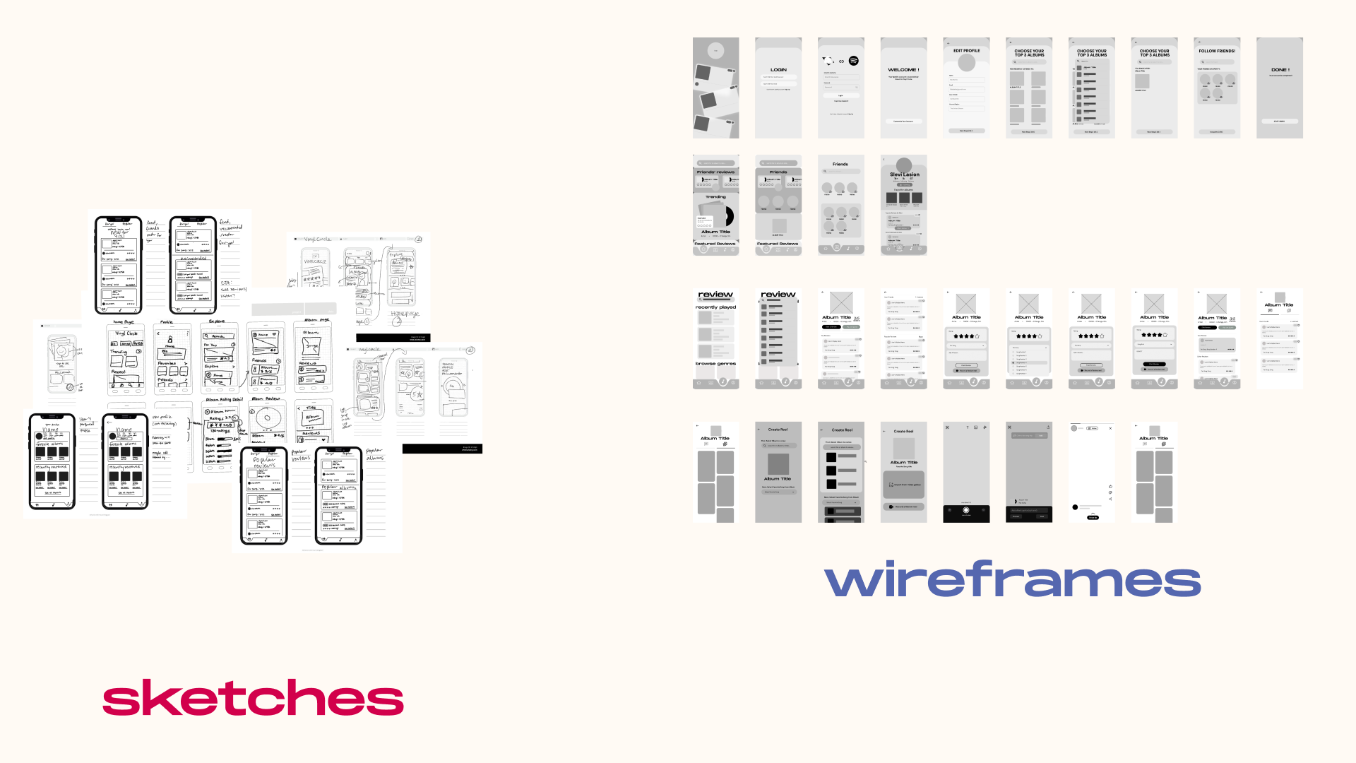
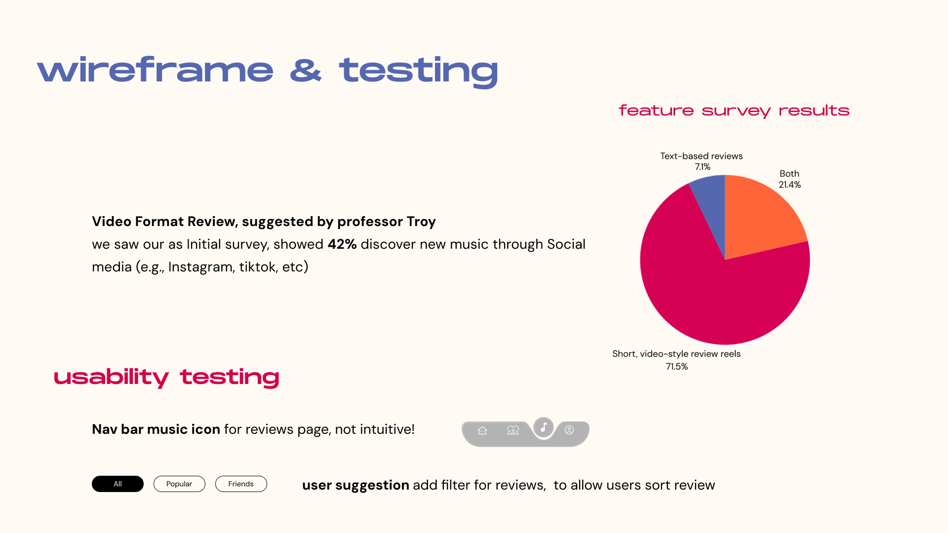
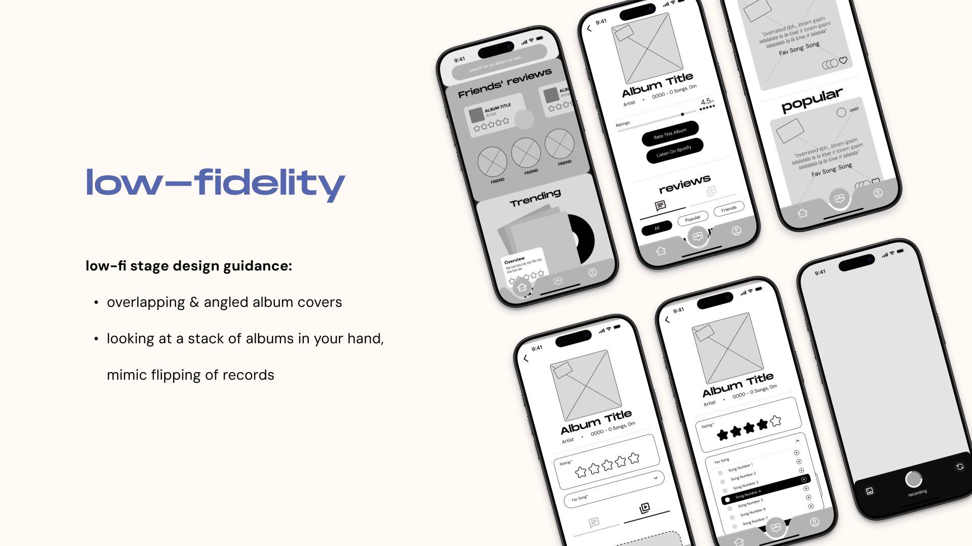
Early sketches explored overlapping, angled album covers and the feeling of flipping through a stack of records by hand, which carried through into grayscale wireframes covering onboarding, home, reviews, and reel creation. A feature survey and usability testing pass followed, confirming short video-style review reels as the clear favorite over text-based reviews.
Key Task Flows
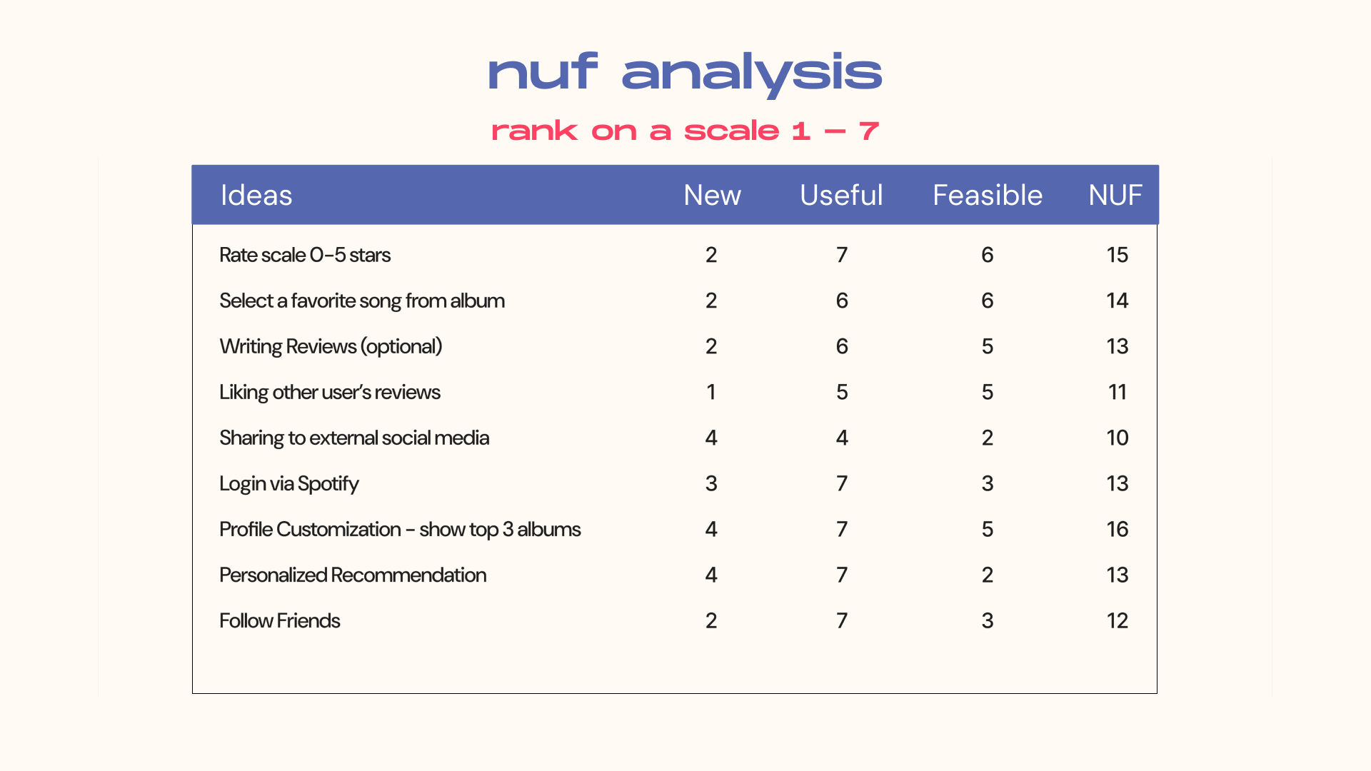
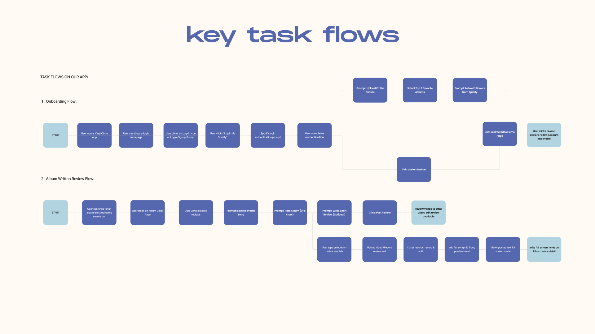
Two flows anchor the app: Onboarding and Profile Customization, where logging in via Spotify pulls profile data before users customize their info or skip ahead to explore who they follow; and Album Review, where users search an album, browse existing reviews, and leave their own — a star rating and favorite song are required, with written and reel reviews left optional.
Low Fidelity
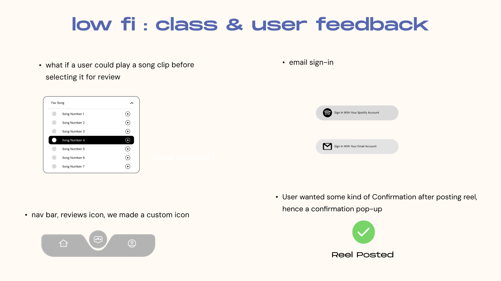
Class and user feedback on the low-fidelity screens pushed us toward playing a song clip before selecting it for review, adding email sign-in alongside Spotify, a custom reviews icon in the nav bar, and a confirmation state after posting a reel.
Mid Fidelity
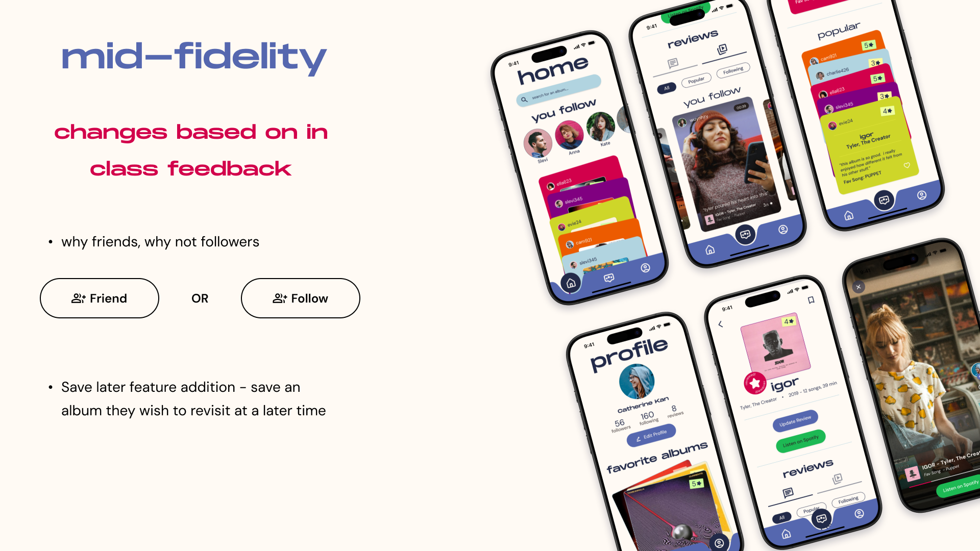
Mid-fidelity screens brought in color and real content, and settled open questions from class feedback — like choosing "friend" over "follow" language, and adding a save-for-later option for albums users want to revisit.
High Fidelity Prototype
Interact with the high-fidelity prototype below.
View all prototype pages!
Final UI